Readability
Readability refers to how easily users can easily read and understand the content of your page. It is important to write to a broad audience and avoid using language that contains a lot of jargon or complex words. The way you organize a pages’ content is important as well. Pages should be structured in a way that is easy to scan and find information. This includes using headings correctly, avoiding large chunks of text, and breaking up the page with visuals when applicable.
Links
Links should be descriptive of the action the user will take or the content the user will go to. Link names like “click here” or “read more” are not helpful to users with assistive technology. Just as with headings, screen reader users can bring up a list of all the links on a page and quickly navigate to the content they are looking for. Without any context a link that reads “click here” will be confusing to a user with no or low vision.
Avoid using link text like this:
Click here for the 2024-25 Student Handbook.
Instead, be descriptive and highlight text that will provide context to where your link is going or what it will do:
Download the 2024-25 Student Handbook.
*Note: You may notice the “Read full story” links on some featured news blocks and news archive lists. While to a sighted user, they appear to all have the same text, additional code has been added to those links to include additional information that is visible only to assistive technology. So, while a sighted user will see “Read full story” a screen reader will read “Read full story” followed by the title of the article.
Headings
Use headings to organize the page’s structure, and not as a decorative element. Headings provide important contextual information to users of assistive technologies, such as screen readers. Correct heading structure also allows for easier readability for sighted users. Blind and low vision users can skim a page by bringing up a list of headings, so these headings need to follow a semantic order to allow the user to get an idea of how the content is organized. Structuring a page semantically will allow a screen reader user to be able quickly navigate to any section of the page to find the information they are looking for.
Think of your page as an outline. The below example demonstrates the correct use of headings.
Heading 1 will always be the title of the page. Your page title should reflect what the page's main topic is. For example, the title of this page could be "Undergraduate degree programs"
Majors
This is the secondary topic and should be a Heading 2. It fits directly under the "Undergraduate degree programs" title.
Major requirements
This should be a Heading 3 since you are starting a new topic about Majors.
Minors
Now you are starting a new set of topics that fall under the "Undergraduate degree programs" title, but is on the same level as "Majors". It should be a Heading 2.
Minor requirements
This is a heading 3 since it fits under the Minors topic.
What NOT to do
Headings should only be used organize the information on your page and not to style text. While a Heading 4 or 5 is styled to be larger and bolder than paragraph text, it should not be used to call out information. If you would like to highlight an important link or important section of text, there are other ways to do that such as bolding the text, adding a button, or creating a Call to Action paragraph.
Images
All images should include what’s called “alt text”. For users who cannot see images on a website and rely on screen readers, alt text offers important context about the images on a page. Additionally, alt text is indexed by search engines, which helps optimize your web content. Alt text does not need to be lengthy but should provide a basic description of what is in the image in relation to the content. Avoid using phrases like "image of" or "photo of" in your alt text description as screen readers will automatically announce that this is an image when reading it to users.


Graphs and infographics
Graphs and infographics often contain a lot of information that would be hard to summarize in a brief alt text description. An accessible way to present a graph would be to describe the information contained in the graph in a paragraph or introduction, then display the image of the graph below this introduction. Your alt text should briefly describe a basic summary of what the graph is aiming to represent as it relates to your introductory paragraph.
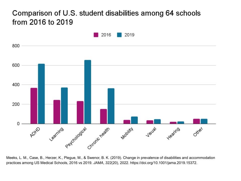
The below example from demonstrates how to display a complex image with data and information so it is accessible for the web. In the following graph there is too much information to describe in alternative text. Instead, we’ll describe it in the introduction. By placing a paragraph first, we also make sure screen reader users can get all the information (Level Access).
Comparing the frequency of U.S. student disabilities in 2016 versus 2019
As the population increases so will the prevalence of disabilities. A 2019 study confirms this after surveying various disabilities amongst U.S. students in 2016 and 2019. Disabilities included: Attention Deficit Hyperactivity Disorder (ADHD), chronic health problems, learning, psychological, mobility, visual, and hearing disabilities. Also included was a broad "other" category. One of their biggest findings was that ADHD had doubled, and psychological disabilities had tripled. Mobility, visual, deaf or hard of hearing, and other disabilities had remained stable.
Tables
Tables should only be used to display tabular data and should not be used to format or style content. All tables should have at least one header row and/or column. This helps screen readers to organize the data and present it to the user in a way that can be easily understood. Since screen readers speak one cell at a time and reference the associated header cells (source: https://www.w3.org/WAI/tutorials/tables/), without this context users could get easily lost in the data. In addition, providing a brief summary or descriptive text before or after the table will also help to provide valuable context.