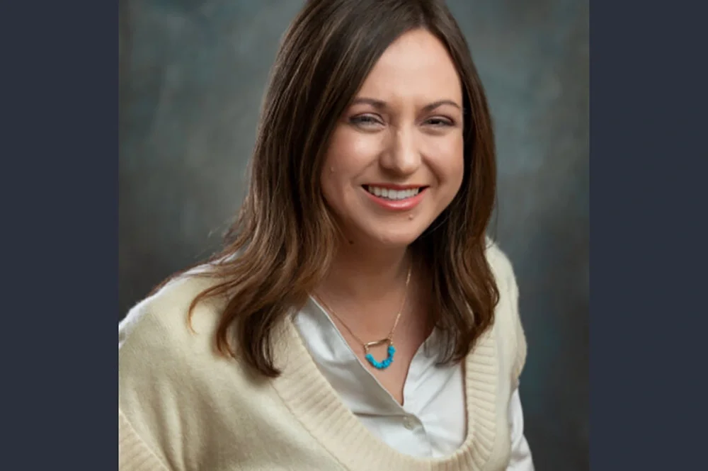
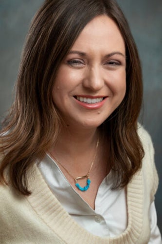
Marynia Kolak is a professor of geography and geographic information science and principal investigator for the Health Regions & Policies Lab. As a health geographer and spatial data scientist, Kolak is committed to understanding how where we live and work shapes our health outcomes—a pursuit that has led her to develop innovative tools and publications that bridge gaps in policy, research, and community advocacy. She recently spoke with the U of I Office of Data Research.
Can you elaborate on your main priorities, for your research and other activities?
I’m a health geographer/spatial data scientist. I use data science techniques, methods, and approaches to solve problems related to health and where we live. We know that just based on where you live, all the neighborhood structures and demographic trends will explain over half of a lot of different health outcomes, which is pretty wild. For example, without any genetic data or access to clinical records, our team found that we can predict over 60% of premature mortality in Chicago. There’s a lot of complexity to why that is.
Way back, when sanitation and infrastructure looked very different, there was an even stronger relationship between where you lived and your health outcomes. As a lot of medical advancements got better and we were able to provide better sanitation, food quality measures, air quality measures, a lot of the standards became elevated and health got better. But now, we’re actually seeing a trend back to that in a lot of ways. A lot of scholars are finding that there is a widening gap in health inequities. The pandemic kind of exacerbated that.
Now, it’s more about who has access to resources, like high quality health insurance, physicians nearby, but also things like public transportation and who has access to job opportunities. That connects them to different resources that other folks might not have. Historical legacies of discrimination, through redlining, racialized real estate covenants—a lot of those will persist even through the initial framework despite legal changes. And a lot of those actual outcomes will persist many years later. My job as a data scientist is to use health geography to frame conceptual questions and theoretical frameworks to understand these complex systems. I try to understand how all of these things fit together and what might be driving how outcomes differ for different people.
So what is your general approach to determining how health outcomes contribute to health inequalities?
Well, you might put in a bunch of variables and out of that, get five distinct dimensions or components that reveal different things about the issue. I’ll work on interpreting those, and then use those indices with health outcomes to see how they contribute to health inequalities. But then I’ll add real-world complexities. If I’m looking at the opioid epidemic, for instance, a lot of data we need doesn’t exist at the scale we need it. Like, “How do we measure stigma?’” I explore different variables, create measures at the neighborhood level, and work with colleagues doing qualitative interviews at the individual level. Then we’ll see how well we did, validating against lived experiences.
For other work, like if we’re looking at environmental injustices, the relationships can be more complex and evolve over time. In these cases, it may be important to integrate diverse datasets and make them accessible, often through web applications like ChiVes, co-developed with community partners. We’re bringing all this data together, and working with community groups to figure out “Are we totally off? How can this data be useful for advocacy?”
Sometimes, the underlying inequities—like segregation in Chicago—play a bigger role in health disparities than the environmental factors themselves. The 1995 Chicago heat wave, for instance, resulted in preventable deaths largely due to social isolation and lack of access to air conditioning. So that’s why there can be a kind of funny causal pathway that we’re trying to treat. And the other part is for different topics. We don’t want to wait 50 years to prove without a doubt that ‘this’ impacts ‘that.’ A lot of groups need data now to make decisions.
Can you talk a little more about the range of applications for the ChiVes tool and other similar applications you’ve developed?
I know that it’s been used for teaching in different Chicago schools at the undergraduate and graduate levels to help inform the next generation of policymakers. We know at least one or two community groups are using it to help build their advocacy plans. One of our goals was to make it easy to provide stats, compelling visualizations, and all of that. Stories are essential for making policy, but so is data. One of the applications most compelling to me was actually a collaborator in Wisconsin. His family lived in the Mississippi Delta. There’s a lot of concern for access to high quality health care in the South, especially because so many hospitals were closed over the past few decades. So he used the U.S. Covid Atlas and worked with the local NAACP to present how communities are being affected in disproportionate ways there.
We’re also active in the policy space for different medication access issues. One of the last papers we worked on focused on a bill in Congress that aimed to expand access to methadone, which is one of the most effective medications for preventing overdose deaths in the long term. That research was ultimately published in Health Affairs Scholar and played a role in policy advocacy, including discussions in congressional hearings. In that case, an interactive web application wasn’t as critical as having clear, well-structured visualizations that conveyed specific, direct information, along with associated statistics presented in a table format. The target audience for that work had different needs. There is no single template for effective communication. There’s a need for scientists in this space who can communicate in diverse ways.
How does your team work to improve the searchability and user-friendliness of complex datasets then?
We’ve found that making the process of working with data—developing web applications and analyses—yields really interesting results. We’ve been working on a toolkit focused on data about social determinants of health (SDOH) in place, and we’ve had a range of users engage with it. Nurses who have gone through the fellows program, community advocates, and even tenured professors have all worked with the toolkit on developing their own web application with SDOH data. Everyone finds some aspects easy and others difficult, but that makes the process worthwhile.
And then the product on the other end has to be really good, right? Sometimes, data scientists create applications that aren’t very user-friendly because they don’t consider art, design, or communication. So, it’s not just about making the data accessible but ensuring the entire process of working with it is intuitive.
One of the major challenges is that so much data is siloed within specialized fields, and people may not even know what to search for. To find something, you need the right search terms—but how do you know what those are? So with one of our new projects, the SDOH in Place Data Discovery Tool, we’ve gathered all this metadata—essentially, data about the data—to create a more intuitive search experience, similar to how Google searching works. We’re also building customized taxonomies to search for different topics.
For example, if you’re looking for data on parks and green spaces, you might not think to search for the Normalized Difference Vegetation Index (NDVI), a common satellite measure researchers use for that purpose. So we’re extending search capabilities and incorporating AI in ethical ways to encourage folks to enjoy that discovery process a bit more and actually bring different data together.
You mentioned the ethical use of AI. What do you think are some trends or emerging technologies that are going to have the biggest impact on geospatial analysis and data science in the coming decade?
So, the “correct answer” in GIS right now, is that everyone’s talking about GeoAI—how to leverage AI to extract more information from spatial data and uncover new insights. A lot of tasks that used to be manual can now be automated and done faster, and this has already made a big impact in geospatial science.
Personally, though, I’m really excited about a different segment: how AI can help us improve the actual theories about what we know. This includes things like knowledge graphs, ontologies, and semantics—that sort of thing, what some might call the “boring” parts of AI. There’s this need for more perspectives and voices. So I think that there’s a lot of interesting options for AI. Instead of looking at the data you get from the end of a project, what can we do to connect the knowledge we already have?
For example, in social determinants of health research, we could input our existing knowledge into AI systems to see if unexpected patterns or relationships emerge. This is using it more as an exploratory or hypothesis generation tool, right? And it can also be used to help, if folks have different ways of asking the same thing that we might not be able to predict—by recognizing how different disciplines frame similar concepts and synthesizing that information effectively. It’s not as glamorous, for sure, but it’s proving to be a pretty exciting process.
Editor’s note: This is a shortened version of a Q&A produced by the Office of Data Research. See the full version here. Read other LAS Experts profiles here.
